Thursday, 14 January 2016
Tuesday, 12 January 2016
Shoot 10 - Work Diary
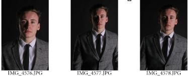
This shoot is considerably different to the previous locations shoots as I have adapted a completely different approach. In this shoot I am beginning to show influence of Brian Smith and Ram Shergill in my own work. The use of colour of no colour can effect the mood of the piece drastically and here I have attempted to enhance the seriousness and formality of the outcomes. In this photoshoot I photographed a male model in dark formal attire. In some cases the subject was lost in the dark background due to its similarity in colour so next time I am going to considered contrasting colours in order to allow the model to stand out. I experimented with studio lighting such as a soft box and also a red head light with a honeycomb grid attached to it in order to direct and concentrate the light on the subject. I used the camera setting F stop 11 and shutter speed of 1/125. Throughout the shoot I experimented with a range of positions and directions I could have the light coming from as well as trying different light intensities. This shoot is slightly bending towards the topic of fashion and how the colours are used in the fashion industry, particularly in regards to men and formal clothing.
Lighting Diagram
This is my favourite photograph from the shoot as it stands out from the rest and is considerably unique in comparison to the others. Here I have placed the subject in the centre of the composition on a stall with his hands in his pocket looking away from the camera. I placed the softbox to the right of the subject, pointing slightly down on him which also projects light onto the floor. The red head light is placed behind the subject facing him which provided a light outline of the subject which allows him to stand out from the black background. Also I have taken the photograph from a higher angle than usual in order to get part of the floor in which is very different to the rest of my images. However, originally there were many flaws and issues with the photograph such as worn areas on the stall and also many creases and marks in the floor and backdrop. Despite this, by using the content awareness and patch tools I was able to eliminate the flaws by replacing them with other cleaner smoother areas in the composition. When doing this the floor then became patchy and didn't look as effective, so I then used the paint tool, using different shades and tones in order to create a gradient from the floor to the black backdrop. This then provided a great sense of depth which is very successful. I then got rid of any blemish on the model's face and altered the colour balance and colour selection create a rather modern, cold colour scheme which works well with the formality of the poses, facial expression and clothing.


For this photograph I placed the subject and light source closer to the background which allowed for the background to be lighter than the subject's suit, allowing him to stand out. I felt it was necessary to do this as sometimes the dark colour of the subjects suit got lost within the black background and shadows. I then used a black and white effect which enhances the formal atmosphere and also the tones/form, complimenting the formal attire. The use of black and white and a suit implies a sense of class and authority. I like the shadows around the side of the face and hands/fingers which imply a sense of shape and structure. The contrast is less intense which allows for a much calmer mood, working well with the pose of the model being him preparing himself. For me I intended to imply the calm before the storm. The framing and use of black and white shows great relation to Brian Smith's work. I could've perhaps included slightly more contrast in order to allow for the subject to stand out more.
Progression:
In my next shoot I would like to use the same model but in a different colour suit, perhaps grey, to will allow him to stand out more from the background. I will experiment with more poses and maybe even props to allow the photos to look more professional.
Tuesday, 5 January 2016
Shoot 9 - work diary
For this shoot I went to a rural location with a model in order to habit a similar style to Steve McCurry's. The makeup and costume are very important in this shoot as they makes/contribute to the overall dirty atmosphere. I applied brown paint and mud to the subjects face and neck and also made his clothes dirty, which was prepared for the shoot in advance. This was effective as the mud dried on the subjects face and clothes which made it look realistic and make it seem as if he has been in the state he is for a while. For this shoot I used a prime lens on my camera which was fixed at 50m focal range. This allowed for a great sense of depth of field through the background being blurred and the camera focussing on the subject's face. I also used the camera settings F stop 2.8, ISO set to 100 and shutter speed at 1/125.
I feel like this is my most successful photo from the shoot. The colours are very effective as a overall scheme has been formed. By using the selective colour tool in photoshop I was able to alter certain colours and create a specific colour scheme. This is particularly evident through the blurred background where the foliage was a rather saturated green. I then muted and desaturated the greens and changed the browns which compliment the colour of subject. Also the white sky has allowed the subjects head to stand out from the background.
I feel that the makeup has introduced a sense of texture on the subjects face which I enhanced through using the sharpener tool on areas where paint and mud is applied. I also used this point on the eyes to allow them to stand out and be the focal point. The colour of the eyes stand out from the light skin colour and also matches the colour of his eyebrows and hair. Also I like the fact that the tungsten tint in the hair goes well with the colour of the background. The facial expression and use of the rural location allows the subject to look lost and the eye contact creates a very intense and emotional connection with the audience.
Although I believe that the colour filters works better than a black and white effect, I still feel that this photo is quite effective. This is due to the photo being taken at a higher angle than before looking down at the subject with the subject looking directly up at the camera. This is used similarly in McCurry's work and I feel that along with the desperate facial expression it makes the model looking seemingly vulnerable; positioning him at a lower level makes him appear less superior and weaker. The back and white filter adds more depth and tone which is particularly seen through the applied makeup and eyes; and also changes the mood of the piece. It produces a very emotional piece which saddens the subjects expression.
Progression:
In my next shoot I will experiment with something which completely opposes this shoot and shows influence of my chosen photographer of Brian Smith. I will do a shoot of a model in a suit with dark backgrounds and low key lighting which will allow for contrast.
Monday, 4 January 2016
Subscribe to:
Posts (Atom)