Thursday 28 January 2016

Print techniques

Image Within Image


Image and Text


Overlay

Selective Colour


Duotone


Montage


Repetition

Framing

Weaving

Cluster


Friday 22 January 2016

Connecting Essay


This is a photograph that I found on the internet which denotes a woman performing a hair flick. She is placed to the right of a landscape composition in front of a white background. There is negative space included towards the left of the composition which creates an artistic composition. The position of the head is slightly tilted back and the women is looking down elegantly at the camera. The colour scheme is considerably neutral with no vibrant colours standing out significantly. The most significant colour would be the skin, particularly the cheeks where it seems that blusher has been applied in order to achieve the orange tint. There are also minimal shadows due to the lighting used which enhances the femininity of the subject, creating a softer, gentler approach. The pose of a hair flick implies a sense of movement due to the position of the hair which stands out greatly from the white background. There is ale a sense of texture in the top of the woman.


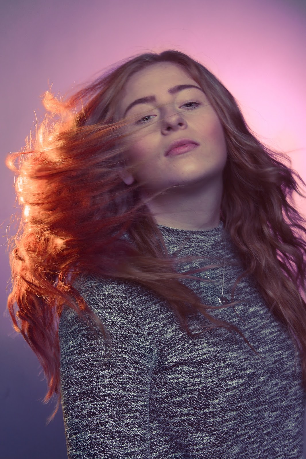
In this photograph I have used a pink background because i feel that the colour pink is is feminine and romantic, tender and intimate, thoughtful, sensitive and caring. It tones down the physical passion of red replacing it with a gentle loving energy. It is a positive color inspiring warm and comforting feelings. I included a yellow gel light coming in form the left side of the composition. However when reviewing the image I felt that the yellow was to bright and harsh on the image to in photoshop I changed the hue and saturation to make it into a much more warm colour which compliments the overall colour scheme. I made sure that the front light intensity was quite low to reduce the contrast. I had editing the skin of the subject where I altered the highlights and shadows on the facial features like I did previously but much more subtly this time. This time I also ensure that her cheeks looked slightly rosy through the use of the paint tool in photoshop and the decreasing the opacity to make it more subtle. This contributes to the femininity and beauty of the model as it makes her look warmer and also makes it seem as if she if wearing makeup. The made the model do a pose where she flicked her here and I took a picture during the process. By doing this a sense of movement is created through the lines of the hair all pointing in one direction. I still ensured that the subject is making eye contact with the camera in order to allow for a connection with the audience to be made. Her facial expression appears peaceful and relaxed which enhances her beauty as she seems to be effortlessly an elegantly moving. The fact that she is placed in the centre of composition and that a vignette is used allows for the attention to be directed towards the subject, making her be the focal point as desired.

These two images can be compared through their use of the same pose where the subject is standing side on to the camera and performs a hair flick. Whilst doing this, the model in both photos still manages to keep eye contact with the camera, introducing a rather elegant facial expression. Also the cheeks in both samples introduce colour, in the top image a orange tone has been added through makeup and in my photograph I introduced the colour red to contribute to the colour scheme. They both consist of colour schemes but of different natures.  The internet image is more neutral with minimal shadow and a lot of brightness, bordering the technique of high key lighting. Whereas my photograph is very feminine, consisting of pinks, purples and reds. The different coloured background contribute greatly to the colour schemes created. Also the compositions and orientations a considerably different as the first image is of a landscape orientation with negative space included; whereas my image is portrait, filling up the majority of the frame.The brightness levels are different as well, as aforementioned the internet image is similar to a high key lighting shoot whereas mine is darker with a vignette applied to drag the attention to the subject. But overall they both create very feminine accounts but in just different ways.


Thursday 21 January 2016

Overall Evaluation

In this evaluation I will talk about the values within my work in regards to artists influences/
research, experimenting with techniques and methods, eventually resulting in my final 
outcome. Our projects are divided up into four different assessment objectives.

Firstly, AO1 consists of the initial ideas and responses to the starting point as well 
contextual research. To achieve high marks in this assessment objective I decided to research and investigate a starting point which is prevalent in every day life and could be very interesting to explore. A mindmap and a proposal of the starting point of colour were created. This displayed my initial response and sequential thinking in order to inspire me to carry out imaginative leaps, allowing me to show a clear journey. When carrying out in depth contextual research I ensured that I analysed their work by using an effective use of critical vocabulary. Thus allowing me to produce sustained and focussed investigations that clearly demonstrate an influence and relation to each of my chosen artists by using similar methods and techniques. I felt that when creating pieces of work showing artist’s influences, I was very effective in showing inspiration from Nadav Kander, Steve McCurry, Brian Smith and Ram Shergill. Due to studying these photographers work my investigations were very sustained, focussing heavily on taking photographs which contained intellectual content and meaning. As the project progressed I showed an increased interest in less vibrant and more muted colour schemes with interest with experimentations with lighting and also depth of field.

Additionally, AO2 is associated with experimenting with appropriate methods, resources, 
media, techniques and material as well as showing an ability to refine my work. I feel that 
my work has been very creative and imaginative as I have experimented with a variation of methods and techniques. Throughout the course of this project I have experimented with lighting techniques such as gel and low key lighting as well as several costumes, props locations and colour schemes. I have also experimented with the Photoshop software which is evident through my computer experiments and print techniques where I explore different processes in order to produce a range of different and interesting outcomes. I also used tools such as the sharpening tool to sharpen certain areas, normally the eye, in order to focus the attention. I also used several tools such as the blemish, content awareness and patch tools in order to remove any flaws and issues in my images. The burn, dodge and paint tools where used to make the subject's seem dirty which was very relevant to Steve McCurry's work. I have constantly demonstrated a fluent ability to refine my work as ideas 
develop by introducing artists’ styles into my own. Initially, I explored very vibrant colours, looking at the connotations of each colour and what they resemble. I feel that in my fifth shoot was a turning point of my project where a photographed a male model at military age in a soldier costume. This consisted of very dark, muted earthy colours which were very emotional and contained a lot of meaning. From this point onwards my work shifted towards using less colour and black and white and what effects they have and what they can suggest in association to the subject and their state. This specifically allowed me to introduce the work of McCurry and Smith.

I also believe I have demonstrated a highly effective command of the formal elements in 
order to create successful photography. I have commanded all the formal elements 
effectively through studying my artists’ work as they all provided me with different 
approaches in order to illustrate specific formal elements. I feel that I have shown an in 
depth subject knowledge which is evident through the annotations of my work where I have used critical vocabulary in order to discuss values. My work diaries from each shoot were 
very successful in allowing me to demonstrate an ability to reflect on my work and progress. In these work diaries I explained the process and equipment that I used and picked two or more pieces from each shoot and analysed them, explaining my view on whether they are successful or not. Also I included a progression section in each work diary which illustrated what I would like to do in my next shoot, allowing me to demonstrate a clear journey. I feel that my use of poses, positioning, composition and lighting were all very effective and contributed to my high standard of photography. I also feel my colour treatment was very relevant in all cases in order to produce certain moods.

Furthermore, I believe that my work is very effective and deemed as exciting due to its 
originality. From the start of the project to the final outcome I have demonstrated a 
consistent high standard of work. I feel that my final outcomes are very effective in 
illustrating the influences of Nadav Kander, Steve McCurry and Brian Smith through he use of their techniques in my own work. Overall, I feel that I have displayed a constant ability to 
produce very original work at a high standard, simultaneously refining it, showing the 
influences of my photographers and resulting in creating very personal response to the starting point of colour.

Connecting Essay

The is a photograph I found of a soldier taken by Marco Grob. The subject is placed in the centre of the composition whilst looking to the left. There seems to be a light source directly in front of the model as well as a black background being used which allows the model to stand out. The model's facial expression looks rather scared and fearful which is further enhanced through the use of the black and white effect. This exaggerates the tone, form and emotion,  perhaps to show the influence of war and how they effect soldiers mentally. There is a camouflage pattern on the outfit of the subject which is stereotypically associated with war and the badge at the bottom right hand corner provides a sense of identity. The brightness of the face is much higher which allows it stand out more and therefore make the facial expression more visible and prominent. 


In this portrait photograph I used low key lighting in order to create harsh shadows towards the left side of the subject's face which contribute to the mood greatly. The light source is coming from the right side of the composition which causes shadows, which are very effective in showing the form of the face and neck. I like how the lighting has caused a reflection in the subjects eyes, allowing them to stand out. Here I also applied makeup to the subject's which in attempt to make him look gritty and dirty and seem as if he has been in action, providing stereotypes associated with soldiers and the army. In photoshop I used the burn tool in order to contribute to the dirtiness of the neck and some areas on the face. I also sharpened some areas more than others in order to imply a sense of texture. I ensured that the colours of the photograph remained very dark with shadows and browns which contribute to the overall earthy mood. Also the black background furthers the darkness in the image which works well with the dark tones and shadows. The fact that the figure is looking away from the camera and is deep in thought provides the sense that he reflecting on his time in the war.

Several comparisons can be made between these two image. For example, the composition of these photographs are very similar. They both are close up head shots with the subject looking away from the camera. The identity of the subjects are also the same through the use of costume to be identified as soldiers. Also there are a lot of darkness and shadows in both outcomes which create very emotional pieces and relate very effectively to war. However, the way in which they relate to war is slightly different. The found image shows the effects of war has on the mental and psychological state of a soldier which is enhanced through the blakc and white effect. This opposes my image being in colour and showing a slight sense of strength as it seems that he has lasted through war, which is recognisable through the makeup applied. He now seems to be in a reflective state on his time in war. The colours in this piece are very earthy and warm which contrast with the black and white scheme in the first image.

Connecting Essay

This image of David Beckham was on an advertisement for Hugo Boss suits. Here David is placed on a chair to positioned slightly to the left of the composition, causing some negative space to the right side of the compositions. There is a light coming from the left side of the frame which causes some shadows on the right side of his face. He is placed in front of a black background which creates a very dark moody piece. David is posing with his hand slightly closed next to his face. He is slightly hunched over but looking directly at the camera. The suit patterns is full of flowing lines which change direction and show the form and shape of his body. The colour of his suit is grey and looks quite cold in comparison to his skin which looks warmer and saturated.

The colour scheme which I have created here has been influenced by Annie Leibovitz through using a similar coolness and temperature. I introduced more blues and less saturation and warmth. Also the colour of the suit has a tint of blue which contributes to the overall colour palette where even the colour of the eyes match the scheme; I also ensured that the highlights and neutrals where cooler. The subject is facing slightly towards the right of the composition but still looking directly at the camera to keep the connections with the viewers. I feel that the pose used makes him look flamboyant and elegant due to the placing of his hand next to his face, this provides a fashion industry aesthetic as I got inspiration from a photo of David Beckham in a Hugo Boss advertisement above. The very stern and serious facial expression creates a very intense connection with the audience. Also I managed to alter and improve the composition by adding slight negative space to the left and right of the subject.

These photographs can be related through the type of pose and clothing acquired to both models and they both produce a fashion style outcome. In both occasions the models are leaning to the side but David is slightly more hunched over. In both cases there is negative space used which creates a very artistic composition. They both are quite dark through the background and type of lighting used. The eye contact made makes a great connection with the audiences. The framing is very similar and the only difference is that they act as opposites to each other. Also David Beckham looks more masculine than my model due to the fact that he is more hunched over and there is more contrast and shadows as well as the fact that he has facial hair. The atmospheres created are both quite tense and serious due to the formality of the clothing and facial expression which are enhanced by the colours. My image is slightly more colder in temperature as it is more muted than the above where there is more saturation in the skin.