Wednesday 30 September 2015

Double Exposure Image Bank

A multiple exposure is the superimposition of two or more exposures to create a single 
image, and double exposure has a corresponding meaning in 
respect of two images.

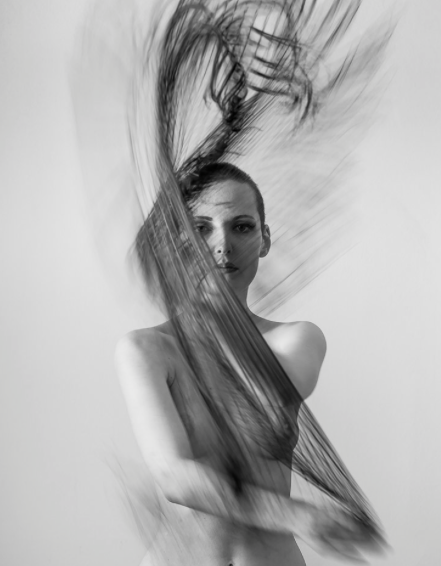
In this photograph, alike a lot of Christoffer's work a plain background is used to enhance the attention and detail to the figure in the centre of the composition. A close up image is used from a slightly low camera angle. This image has been merged with a photograph of a forest where trees and bushes are visible. The forest is composed of various lines and shapes which are enhanced by the black and white effect used. Despite the merging of the two photographs the left eye, nose and a part of the mouth can be seen through lighter tones. The overall outline of the piece is in the shape of the human, filled with forest detail. It could be considered that this double exposure provides a sense on adventure that perhaps the subject has been on through the forest.


This pieces of photography uses a slightly different approach as this time the leaves/trees are the dominant figure with a man's face blended into the centre of the composition. Patterns of leaves are used to show the hair and eyebrows of the figure. Darker tones are used to show the form and detail of the man's face. This time a plain light background is not used, as the leaves continue and fill up the whole composition. The areas surrounding the face are much darker and therefore highlights the face, making it more bold and it therefore stands out in the detailed surroundings. Perhaps the fact that the subject blends in with the background portrays a disguise or front that the subject might be putting up. It even could be interpreted that he is not noticed or unique and just blends in with everything.


These two multiple exposure pieces are very unique as instead of using a human as the subject, here animals are being used to blend with a second image. I feel that these are very successful as the photo of the animal and the landscape work well together and compliment each other. I feel that this use of the two images has a purpose of showing the animals and the habitat/environment it lives in They both include a forest image including conifers which complement and resemble the texture of the animals fur. Also a sense of depth is shown through the trees getting smaller towards the top of the composition, they also are much lighter in tone and seem mighty/foggy which imply distance. These two images are very effective in showing the different ways the composition can be filled. The first image shows the whole body of the wolf whereas the second photo shows the wolf's head from a side-on angle.

With this piece of double exposure photography the outline of a humans head/shoulders/side profile is used and another photograph of a pile of cigarettes fills the outline. The dark tones of the ends of the cigarettes illustrate that they have been used and perhaps could suggest that the subject is the one who has smoked them. It could imply a sense of addiction in which the subject could have and the number of cigarettes seen can imply the depth of the addiction. The fact that the background is light allows the shape/outline of the subjects profile to be enhanced.


Multiple Flash Work Diary

In this shoot I experimented with the technique of multiple flash, where one single long exposure is used and several flashes are used to capture the subject in different stages of movement. In order to do this I had to set the camera to the bulb setting. I then measured the aperture level of the flash from the light source with a light meter. This then told me that I was acquired to set the camera to F11. The lights were then turned off and then I was ready to begin shooting. Initially I used a soft box as the source of the flash however the flash was spread out in a large direction, causing the background to also receive some light and in some cases cause the image to look over exposed. I then replaced the soft box with a snoot which then narrowed the direction of the flash, concentrating it more on the subject instead of the background. Therefore allowing the background to be much darker, ensuring that the figure will be more clear.
In this photograph I attempted to capture the movement of the subjects face as she turns her neck. I used 5 separate flashes in order to capture the movement clearly and it seems that there are many faces on one body. However due to the hairline/fringe of the model, the faces dont blend together, instead they seem separated. This also creates an interesting effect as various shapes can be seen. The great contrast with the background allows the subject to stand out and allows the different images to be seen. Also I like how the subject is slightly placed to the left of the composition and it almost gives the effect of the subject looking over her shoulder into the darkness behind her.

In this attempt at multiple flash photography I experimented with ways in which I could capture the body moving. Initially I thought of someone dancing however the flashes were not quick enough in order to capture the moving subject. So I then got my model to simply slowly move her arms from her side to be having them up. I took 5 different flashes with equal intervals between them in order to make them look the same distance apart between each arm. This technique shows a pattern which the straight lines of the arms as they appear to all converge towards the centre of the composition. Also a sense of symmetry/reflection can be noticed if you cut the image down the middle, both sides would look almost identical. I enhanced the blues of the denim dungarees and the whites of the t shirt in order to allow the subject to stand out from the dark background. The majority of the background appears to be black, apart from the bottom left hand corner where it seems to be more faded and lighter than the rest. To improve this piece I could perhaps take it again and ensure that no smears/fades are visible in the background and I would also like to attempt to take even more flashes in order to make it seem like there are more arms coming from the body.

Monday 28 September 2015

Multiple/double exposure work diary

In this shoot I began to explore the photography technique of double/multiple 
exposure. A multiple exposure is the superimposition of two or more exposures to create a single image, and double exposure has a corresponding meaning in 
respect of two images. I learnt this technique by following tutorials on Youtube. 
Once understanding how to actually create a multiple exposure piece I began 
taking portraits of class members and also photographs of trees/plants/flowers. 
After collecting all the images I needed to, I then edited them in Photoshop. Firstly I opened the photo of the subject and erased the background to white by using 
the rubber tool. I then put the picture of the trees over the top and applied the 
setting of 'lighten' to to the layer type which merged the two images together and therefore
 creating the double exposure. After that I altered the hue/saturation, curves and 
colour balance of the pieces and even applied black and white filters.
In this multiple exposure piece I have used a portrait of a model who is facing towards the right of the frame. Also I have placed the same photo of leaves three times over the top of the image in order to gain the shape in which i have. The way the white spaces erase parts of the body implies that the subject has lost herself and parts of her body; being her head and her heart. This corresponds to the facial expression that makes it seem as if she is in deep thought. Suggesting about she is reflecting on her life. The colours are also very significant to the piece, the colours of reds, oranges and brows are very autumnal and resemble the autumn season. The goes with the erased areas in the composition as autumn represented things falling apart. 

In this double exposure I have used another portrait of a model but this time facing towards the left side of the frame. I have also merged an image of a building instead of natural objects such as plants and trees. This can suggest a place in which he has visited as the image is in fact of Big Ben and therefore can imply going on a journey, being a tourist. The great contrast which the dark building and the white background enhances the sharp texture of the building and enhances the lines and shapes which represent the structure of the building.

Saturday 19 September 2015

Colour Definition Post

Official Definition - The property possessed by an object of producing different sensations on the eye as a result of the way it reflects or emits light.

How Colour could be described:
Saturation
Glow
Hue
Tint 
Colouration
Tinge
Complexity
Bold 
Dull
Scheme
Vibrant
In this photograph of many people in hooded clothing, colour is very dominant and a clear contrast is visible. The bright vibrant red hood contrasts with the rest of hoods in the composition being black which allows the red hood to stand out rather significantly. This contrast enhances the shape of the red hood as the dark surroundings exaggerate the outline of the red hood.Also the fact the red hood is placed in the centre of the composition and that the camera is focussed here, blurring the surroundings, allows this area to stand out from the rest. The burst of colour in the centre of the frame gives a sense of individuality and difference as all of the other hoods are black which is very intriguing.


In this picture there is a female dressed in a green mac coat is placed in the centre of the 
frame holding a red apple. The colour of the coat contributes to the overall green colour 
scheme as is matches the colour of the green organic background. Also the colour red is 
included as a feature colour and compliments the greens. The contrast between the greens and the reds allows the red apple, lips and flowers to stand out more. The overall effect of 
the colour scheme is very natural and the colour green resembles nature, plants and 
greenery. The prop of the apple also contributes to this theme.
  

In this image the most dominant colour is turquoise which can be seen in the eyes and the 
sari. There are lines which show the texture of the ripples in the sari, also there are shadows on the rights side of the composition which smother the right eye. The use of shadow as 
well as the use of the costume of a sari suggest themes of mystery and makes the audience curious as it seems as if the subject is covering up their identity. The fact that the only facial features that can been seen are the eyes intensifies the eye contact with the audience and allows the eyes to be the focal point. As the eyes are the focal point, the interesting colour of the eyes are more noticeable. The turquoise colour scheme provides a sense of fantasy 
and adds to the unknown identity of the subject.


This is a photograph denotes a road which travels down the centre of the composition with a row of trees either side of it. The dark edges of the frame of the pictures enhances the brightness of the centre of the composition, which exaggerates the vibrancy of the orange trees. The different tones of orange and yellow and brown indicate the season in which the photo is taken being autumn.

My own Definition - An aspect of the physical appearance of a subject which contributes the the mood and atmosphere created.


Thursday 17 September 2015

High Key Lighting - Image Bank

In the following images the technique of high key lighting is used, this is a style of lighting for film, television, or photography that aims to reduce the lighting ratio present in the scene. High Key lighting reduces the contrast of light, minimising shadows and enlightening the whole image, with a range of light tones and whites and not very many blacks or mid-tones. High key lighting is often used in fashion and portraiture with light backgrounds and is often associated with a feminine  or youthful approach.
These two images both are organised in a portrait orientation, capturing the model from around the shoulders upwards. Due to the high key lighting technique both of their backgrounds are white, which allows the subjects to stand out. In both cases minimal shadows can be seen, in the left image there are some shadows on her fingers/hand and on the right image there are some shadows on her cheeks and neck. The rest on the subjects skin are very light, in the right image this has been enhance by the makeup, ensuring that she herself is white. Due to the skin and most of the image being so pale and light, this allows the coloured parts of the image to be intensified and exaggerated. In both cases makeup is used to introduce colour and also the colour of the eyes are enhanced. 


These two photographs provide a very feminine feel, both models are standing slightly side on with there head turned and looking directly at the camera with an intense facial expression. In the portrait composition it seems as they are not wearing a top so the collar bones and frame of their bodies can be seen through the slight shadow and highlights. Once again makeup is applied to add colour but in these cases it is applied on a much smaller scale. Small amounts of eye shadow and mascara have been used to ensure that the eyes stand out. Both backgrounds are light but the right images background is slightly off white, to compliment the colour of the subjects skin. In the left image a prop has been used to introduce a sense of colour, an accessory made out of flowers is being worn, which also contributes to the sense of femininity and beauty.


These two images are slightly different to the rest of the images as they are both in landscape orientation. They are both front on to the camera and fill up the composition similarly. The subject has been captures from shoulders upwards and also cutting of the top of their heads. In these cases, high key lighting is used in oder to amplify the subjects' youth. White backgrounds are used and also the only strong shadows are on the neck and mouth due to their positions and facial expressions. In the second photograph, the colour of the eyes are enhanced due to the paleness of the rest of the composition


Slow Sync - Image Bank

Slow sync is a feature available on a wide range of digital cameras that enables you to fire the flash at lower shutter speeds. It permits you to keep shooting in a variety of low-light situations, thereby opening up new possibilities. By using slow sync flash, you can get a properly illuminated subject/foreground, yet still have the low ambient light in the foreground and background register in your frame. Many digital cameras let you set slow sync flash manually, but even on point and shoot cameras you have the ability to shoot at slow sync. In order to shoot slow sync photography, you need to preferably have a dark background and a  soft box to be able to see the object. The modelling light in the soft box records the blurred movements of the subjects and the flash freezes the image, capturing the still sharp image.
This photograph demonstrates the slow sync technique but not in regards to shooting in a studio. Instead this is a black and white photograph of a waterfall. Due to the slow sync the water seems almost smooth in texture and misty as it falls off the rocks in various lines. However there still is a sense of a dark background through the rock face which is virtually black and allows the form and shape of the water to be enhanced. This great contrast gives a similar effect as to the one applied in the studio. The is a sense of depth  through the way the water bends and how the rocks get smaller towards the right of the composition.


The two images above are very similar as they both present the same subject matter of dancing. They both have black backgrounds which amplifies the shape and form of the subjects. These backgrounds are very effective in showing the blurred/smudged streaks and lines which represent the movement of the subjects. Within the blurred areas, various shapes can be seen which show the different stages of the subjects body movement. The contrast between the shadow and highlight areas are very effective in showing the form of the dancers' bodies. Also the arms and legs are very straight and direct which give a sense of lines. However there is a slight difference in the compositions of the two images as the first one is portrait and seemingly closer than the second image. This work effectively as is work accordingly with the dance move due to the subject jumping. This differs to the second photograph as it is landscape and more zoomed out which allows the dancers forwards/sidewards movement as the blurred lines streak to the left of the sharp frozen image.

This is another photograph which was shot in the studio with a black background but instead of showing the movement of a human or an object, it shows the movement of an animal and in this case a bird. There is a frozen image in the centre of the composition consisting of the main body of the bird and the fact that the bird is white allows it to stand out and allows for the movement to me seen evidently. There are arching lines which begin at the bottom of the birds body and end towards the top of the frame. This gives the impression of the bird's wings moving in order to fly. Along with the positioning of the birds head and the blurred section underneath the bird, the overall feel is that the bird is ascending. 

In this image a different approach has been made. Instead of using a dark background, a white background has been used. Usually with slow syncs a dark background is used with a light subject so there is a clear contrast which allows the movement to be seen. This picture acts as a invert to this method as there is still a contrast present which allows the movement to be seen but just in the opposite way. Here the frozen image is a woman which is looking directly at the camera whilst seeming to be waving an object about. The dark object causes dark lines to be made to make it apparent what direction it is travelling and also provides a sense of shape and from. There are thinner/smaller lighter lines which appear to be further away and provide a sense of depth.


Wednesday 16 September 2015

Project Proposal

For this project I plan in investigate and experiment with the starting point/topic of Colour. I know that colour is a vast topic to study but I intend to narrow it down to the use of colour in photography and the connotations colours have. Im not necessarily going to take photos of bright vibrant colourful objects, I am going to focus more on the moods and atmospheres that I can create with specific colours scheme.I could investigate this in various ways, for example I could shoot portraiture in the studio and have specific colour schemes which would resemble certain things and I could also perhaps make to model do a specific facial expression which corresponded to the colours connotation. For example, the colour red has various connotations of moods/feelings. So I could do a shoot of a subject dressed in red and experiment with the moods I can create by applying a facial expression to the model.

Another thing I could potentially do in the studio is experiment with paint in several ways. I aim to apply paint to a models face in a very abstract style which would show the influence of Alexander Khokhlov's work. Also, alike Alexander I could paint words on to the models face in order to portray their emotions/feeling and even suggest issues in the current modern society. Similarly to thing I would also like to experiment with UV paint and also coloured powder to gain a very unique approach. This would also allow me to use other photographers styles and tendencies such as Rankin and McGibbon in my own work. I could also experiment with lighting and the specific moods which they create.

I would also like to use water and how it changes the colour of some solutions. I could also get food colouring and put it into the water and see what bright colours they are and the fantastic shapes they form. Similar to this I could take a picture of water splashing on someone's face of just droplets on water and change the colour of it in Photoshop. I could then investigate with the theme of changing colour further and then forming a new pathway for my project. I could capture things changing and being different colours in real life or I could also take a photo of something and change the colours of it in Photoshop. I could do this with a shoot which I have done of buildings in London and alter the appearance of some monumental landmarks and attractions. Additionally I could take a photo of a subject with a paint brush over the top of it. The whole composition would be black and white whereas there would be a streak of colour where it would appear that the paintbrush has painted on the colour. I could specifically do this with a person who appears to be painting  colours onto their own black and white face and the message created could be very meaningful.

My Project in a sentence - An investigation of the concept of colours and their many representations.

Monday 14 September 2015

David LaChapelle

Over the course of his 30+ year career, LaChapelle continues to be inspired by everything from art history to street culture, from the metaphysical to immortality, projecting an image of twenty-first century pop culture through his work that is both loving and critical. Always aware of larger social implications, LaChapelle’s work transcends the material world. He is quite simply the only photographic artist working today who has been able to successfully maintain a profound impact in the realm of celebrity photography as well as the notoriously discerning contemporary art intelligentsia.

David LaChapelle is known internationally and in Israel as a photographer, a director of documentaries, and a video artist whose colorful, smooth and extroverted style is filled with sensuality, fantasy, and dark adventure, packed with accessible popular images, and communicates with a wide and variegated audience.

Albeit daring, the nudity in these photographs does not result from him being trigger-happy, nor from an attempt to surprise and shock. Even in his commercial photographs, LaChapelle combines criticism of the marketing method whose objects are all those taking part in its constitution, including the target audience (of both the marketed product and the photograph as an object), and even the photographer himself as the one who creates the bait of the sales scheme.

LaChapelle does not sanctify the erotic facet in order to satisfy the voyeuristic urge or the curiosity of an audience of viewers and fans; he prefers to celebrate the freedom to use it precisely in order to liberate the representation of the body, primarily the female body, from the pornographic context, from erroneous interpretation, and from the inevitable association of nakedness with sin, or the mechanical association of passion and lust with sexual gratification, abuse, and humiliation.

Most of the photographed subjects in the exhibition are neither actors, singers, or major glamorous figures, but rather models whose very anonymity makes for a criticism devoid of gossipy preaching, of ascription to a specific figure or episode; criticism directed at a social moral content which converses with life and the art world.


Kanye West - boxing

Denotation - Kanye West is wearing a red boxing costume with white boots. The background is black which contrasts with the white floor. Also there is two spotlights which allow him to stand outs and show his shape and form. He is looking directly at the camera whilst in a boxer stance

Connotation - He is in-fact imitating the famous picture taken of Mohammed ali as he stands in the same stance. By relating the two pictures you can see that kanye's expression seems much more forced, passive and unnatural whereas Ali's is natural and seems passionate.


Friday 11 September 2015

Minimum Depth of Field

In this shoot I practised using the minimum depth of field technique where 3 factors come into play. Firstly I had to make sure that my camera is set to its maximum apature and also its maximum zoom. Then i stood reasonably close to the figure to make the subject fill the frame from roughly the chest upwards. When doing this, and all of the factors are used correctly, I was able to get the effect of blurring the background and the rest of the composition whilst still keeping the subject in focus. This allows the subject to stand out as they will be the much detailed in comparison with the rest of the frame.

I feel that this photo is really effective as it shows depth of field very successfully. The background is very blurred in contrast to the subject in the foreground. The contrast between the light and dark tones shows the shape and form of the objects. In the whole composition the dark tones show shadows which tend to be to the left/bottom side of the objects, therefore indicating the direction/position of the light source. The colours of the photo are also very bright and eye catching and vibrant, the subject is a very different colour to the rest of the composition which allows the subject to stand out. The effect is enhanced by the fact that the subject is placed in the centre of the composition.